Giovanni Trivellato / Process & inspiration

Nothing starts
from zero.

A bit about the references, experiments, and ideas that slowly turned this portfolio into something that feels much more like me.

01

The first portfolio

A project that worked, but still did not feel as much like me as I wanted.

2025 · The starting point

I wanted my Front-end teacher to show my portfolio to the following year's students. That is exactly what happened.

And it worked. Besides being shown to the next year's students, it was selected as one of the best portfolios of my year. I still care a lot about it, but something always felt off. I would change one part, try another idea, and still never feel fully happy with it.

I still really like the colors, project cards, opening page, and side navigation. The first skills section, contact area, and footer are the parts I still look at and think: that was not what I wanted to communicate.
02

From references to interface

More or less in the order I found each idea and thought: “this could look cool”.

First attempt

One reference opened the way, but something was still missing.

As I usually do when I need ideas, I spent some time browsing Pinterest. I found this design, really liked the concept, and decided to try it in my portfolio. I even made a small animation for it. It looked nice, but the page still felt way too empty.

First visual reference found on Pinterest
Reference: @artemkutcher
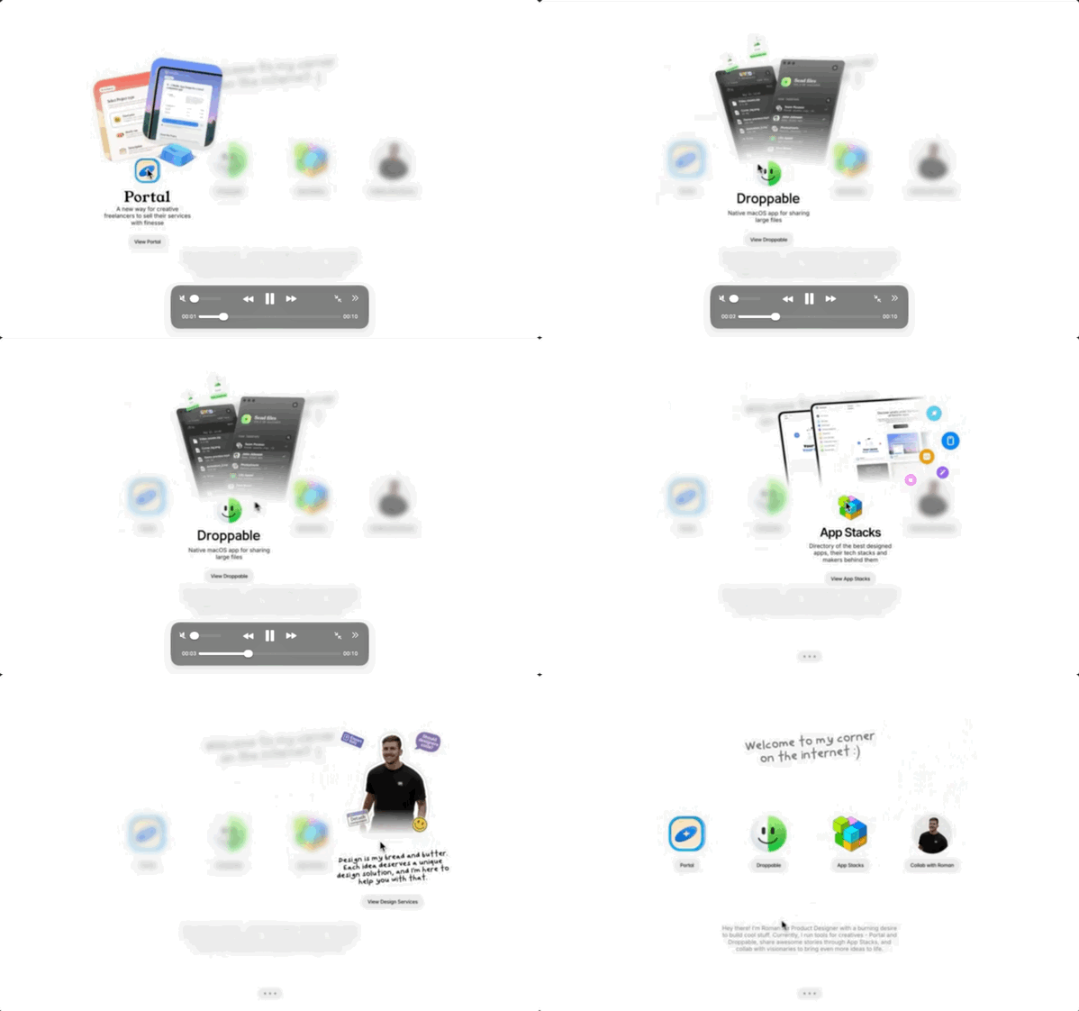
Folders, not apps

That was when the page started getting more personality.

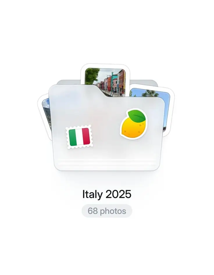
Then I found this folder reference and thought it made more sense than using regular app icons. The page became much more visual and started moving closer to the style I wanted.

Folder based reference used on the home page
Reference: @ontoflow
Composition

A 2 × 2 grid, cards around the edges, and the content in the center.

Then it was time to fix the layout. Instead of keeping everything in one line, I built a 2 × 2 grid and placed the main content in the center. One reference suggested the surrounding cards and the other looked like a table full of icons. I mixed both and adapted them into something cleaner and more “Apple”.

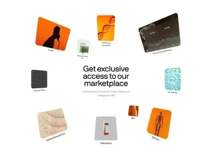
Reference showing a visual table of iconsReference with cards around central content
@abhishekbariyaa + @ruslan_siiz
Inner pages

It took a while, but I found a structure that worked for everything else.

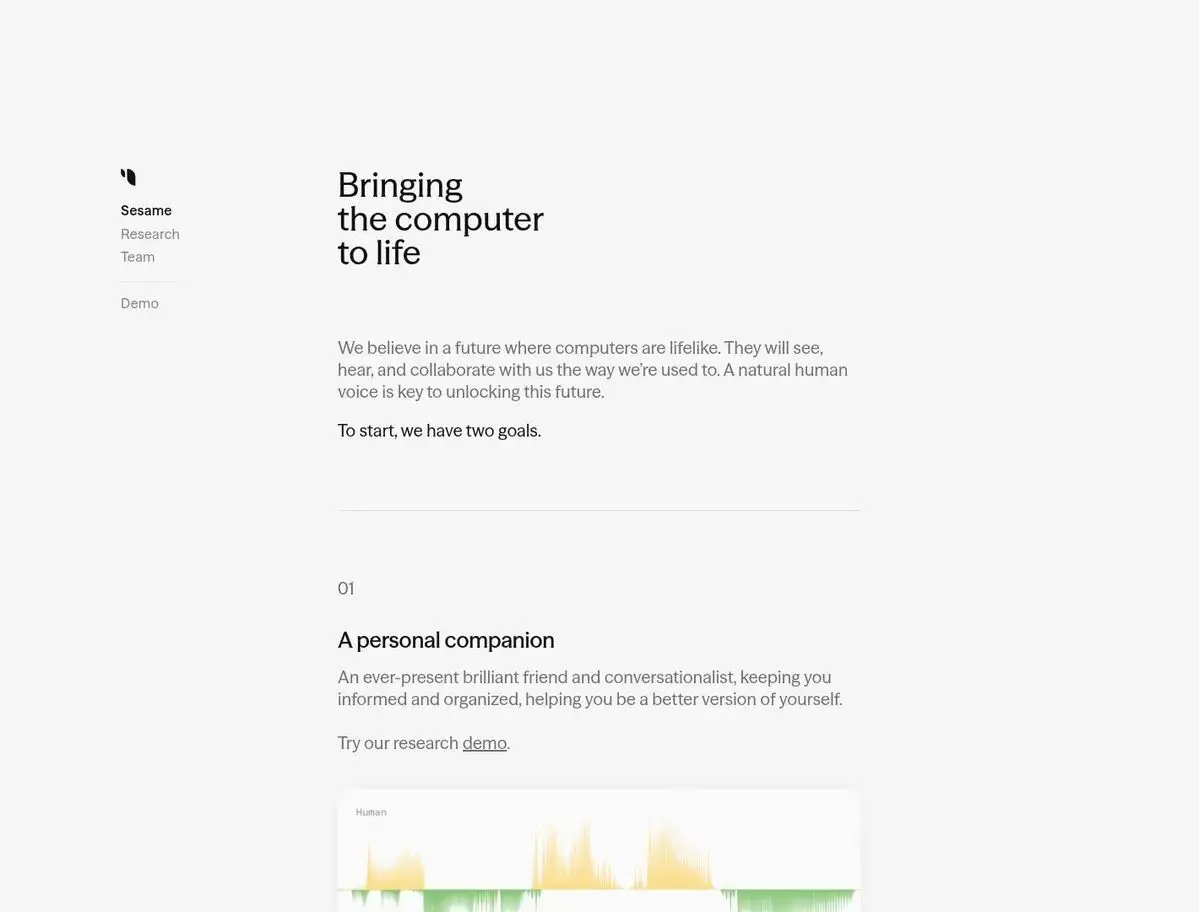
The home page was coming together, but I had no idea what to do with the inner pages for quite a while. When I found this reference, I liked the organization, spacing, and side navigation, so I used that logic as a pattern for the rest of the portfolio.

Layout reference used for the inner pages
Creator not identified
A real path

Education and experience did not need to be just a list.

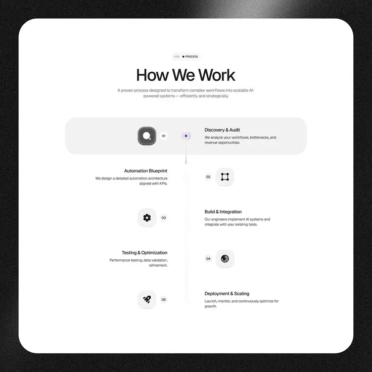
I wanted this section to feel like an actual path. I used the reference as a base and connected the dates, schools, and internships into a more visual sequence.

Reference for a vertical timeline
Reference: @ninhstudio
03

Motion and identity

The references ended up changing much more than just the layout.

Off+Brand

This is what made me want to animate everything

Lando Norris's website had been catching my attention since last year. I looked up who made it and found Off+Brand. I loved the hamburger menu, cursor, arrows, and especially how motion was part of the navigation without making the experience feel heavy. That made me search for a way to create my own animated icons for websites and apps.

LottieFiles

From curiosity to practice

That search led me to LottieFiles. I started with lessons, took courses from the platform, and learned how to prepare animation for interfaces. That is where the hamburger, arrows, form button, and several smaller details on this site came from.

Apple

Beautiful, clear, and never overdone

I have always liked the way Apple combines a polished visual style with simple communication. I wanted some of that feeling here, and it also helped me organize the trvzera identity, moving it from orange and gray to white and blue.

04

What remained from the process

Once I found the right direction, everything else started flowing much more naturally.

Design as communication

“If you copy from one author, it’s plagiarism, but if you copy from many, it’s research.”

Steal Like an Artist.

In the end, I took a bit of the essence from each reference and adapted it until it felt like me. Along the way, I kept reading Don't Make Me Think, following Apple's design documentation, and taking Origamid's design course.

For me, design and communication are some of the most important parts of any website, app, or brand. A project can be really good, but if it cannot show that properly, the first impression already feels wrong.

A design never comes from one thing alone. It brings together different references, experiences, and choices — and the way each person combines them is what makes the result unique.
05

Credits

The profiles I managed to find behind the references used in the process.

Back to top